Metal business cards are overkill for most people.
And that’s exactly why they work, when they’re done with restraint.
If you’re ordering your first batch, you’re not really buying “cards.” You’re buying a tiny object that sits in someone’s pocket and silently argues for your credibility. That means the decisions aren’t cosmetic. Material, finish, thickness, edges, and marking method all change the way the card behaves in the real world: under harsh lights, greasy fingers, cramped wallets, and awkward networking moments.
One mistake I see all the time: people spec a gorgeous metal card that’s unreadable from two feet away. Don’t be that person.
Start with the real question: what impression are you trying to land?
You don’t pick titanium because it’s “the best.” You pick it because you want the other person to feel, subconsciously, that you operate at a higher tier. Same with a heavy stainless card that thunks onto a table, there’s theater in it, which is exactly why brands exploring premium options like Metal Kards focus so much on feel and presentation.
Now, this won’t apply to everyone, but if you’re handing these out at high-volume events, metal can backfire. It turns into a gimmick fast. For selective, high-intent meetings? Different story.
One-line truth:
Your card should feel like your brand sounds.
Material choices (and what they signal when no one’s saying it out loud)
I’ll switch voices here and be blunt: most first-time buyers should start with aluminum.
Aluminum is light, clean, and forgiving. It’s easier to carry in quantity, and vendors can do a lot with it, anodizing, color fills, crisp laser work, without pricing you into regret.
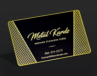
Stainless steel is where you go when you want weight and longevity. It reads “serious.” It also reads “I planned this.” Downside: it can get pricey with complex finishes, and it’s noticeably heavier in a pocket if you carry a stack.
Brass and copper look fantastic in photos, and they age in a way some people love (patina can feel artisanal, or it can feel messy, depends on your brand). Titanium? Luxury, performance, and the highest bill.
A quick and practical breakdown:
– Aluminum: light, usually cheapest, great for color/anodized looks
– Stainless steel: durable, premium heft, excellent wear resistance
– Brass/copper: warm tones, high character, patina over time
– Titanium: prestige + toughness, but you’ll pay for it
Look, your customer doesn’t care what metal it is. They care what it suggests about you.
Thickness: the quiet flex (and the part that messes up wallets)
Thickness is a signal before anyone reads your name. Thin feels modern and agile. Thick feels expensive and deliberate.
Here’s the trade: thicker cards tend to look and feel premium, but they can be annoying to carry (for you and for the recipient). If someone slides it into a tight wallet slot and it bulges, guess what happens? It “mysteriously” gets left on a desk.
In my experience, mid-thickness wins most of the time. It’s substantial without becoming a pocket brick, and you can still get clean engraving depth and edge detail without special handling or dramatic shipping costs.
If you must go thick, design for it: bold typography, fewer lines of text, high contrast. Thin cards can carry more intricate visuals, but don’t expect them to deliver the same “wow” when dropped on a table.
Finishes: choose for lighting, not for aesthetics
People pick mirror-polished metal because it looks expensive on a product page. Then they bring it to a conference ballroom with overhead LEDs and suddenly it’s a reflective mess. Glare eats legibility.
Here’s the thing: the best finish is the one that behaves under ugly light.
Matte, satin, and brushed finishes are usually safer. They photograph well, resist fingerprints better, and keep text readable. Polished finishes absolutely can work, but you need strong contrast and a layout that doesn’t rely on hairline details.
Color has psychology baked into it too. Cool silvers and gunmetals read modern and technical. Warm golds and bronzes read traditional, luxury, “established.” Neither is better, just louder in different rooms.
Quick guidance I actually use:
– If the card will be read quickly at arm’s length → brushed + high contrast
– If it’s meant to be admired up close → polished can work, but simplify the design
– If you want “premium without shouting” → matte/satin every time
Engraving vs. printing (and why most people oversimplify this)
Engraving feels permanent because it is. It’s literally removing material or marking it below the surface. That permanence communicates confidence. Also, it tends to survive keys, pockets, and time better than surface inks.
Printing is more flexible. Great for color gradients, photos, and fast iteration. Less great for abrasion unless you’ve got a robust coating system, and not all vendors do.
Where it gets technical: coatings, anodized layers, and surface hardness change everything. A laser mark on anodized aluminum can be brutally crisp; the same design on a reflective stainless surface might look washed depending on angle and lighting.
If you need a rule of thumb:
– Want timeless + durable → engraving/etching
– Want full color + fast changes → printing (with a quality coating)
Edges: the detail you’ll feel before you see
Edges are underrated, and they shouldn’t be. A sharp square edge can feel aggressive (sometimes that’s perfect), but it can also snag, scratch, or feel uncomfortable. Rounded edges are friendlier and more pocketable. Bevels and chamfers add that “finished” look that screams intentional craftsmanship.
There’s also a visual trick: edge geometry changes shadow and reflection, which changes readability. A subtle bevel can frame the face and make engraving pop. Or it can catch light and distract, if the rest of your design is already busy.
If you’re unsure, go with a small chamfer. It’s the safe middle ground that rarely looks cheap.
Turnaround time and shipping: assume friction
Production time is usually the hidden variable: complex finishes, multi-step coatings, and deep engraving add days. Then shipping does what shipping always does, acts reliable until you actually need it.
International orders can get stuck in customs. Rush orders can still miss if a proof needs approval. Build slack into your timeline.
One practical move: order a small sample run or proof set if the vendor offers it. It’s cheaper than discovering your “high-end” design is unreadable in real life.
A real stat, since people like anchors: the U.S. Census Bureau estimates e-commerce retail sales were $289.2B in Q1 2025 (seasonally adjusted), which gives you a sense of how strained fulfillment networks can be during peak cycles. Source: U.S. Census Bureau, Quarterly Retail E-Commerce Sales (Q1 2025).
Budgeting without getting played by upgrades
Suppliers love add-ons. Some are worth it. Many are fluff.
Spend where it changes the user experience:
– a finish that reduces glare
– engraving that stays legible
– edge work that feels good in-hand
– coating that doesn’t chip or smear
Save money by avoiding “feature stacking.” You don’t need thick titanium and full-color print and cutouts and mirror polish unless your goal is to flex on other people’s business cards.
Budget a little for iteration too. The first design is rarely the best one.
Using metal cards in real networking (don’t spray and pray)
Metal works best when it’s deployed like a signature, not like confetti.
Give it after you’ve earned a moment of attention: a solid intro, a quick exchange, a clear reason you matter to them. Then let the object do its job. If you hand it over too early, it reads as performance. Too late, and they’ve already categorized you.
For verification scenarios, consulting, security, finance, specialized trades, it helps to pair the physical card with something instantly checkable: a QR to a credential page, a portfolio, a booking link, whatever fits your world.
And yes, be selective. Scarcity is part of the effect.
A short checklist I’d actually use before ordering
– Will this card still be readable under harsh overhead lighting?
– Is the thickness impressive without being annoying to carry?
– Does the finish resist fingerprints and scratches reasonably well?
– Is the marking method durable for pockets, keys, and repeated handling?
– Does the design look like my brand, or like a template for “luxury”?
If you can answer those cleanly, you’re ready to order, and you’ll probably avoid the classic first-timer mistake: buying something that looks expensive and performs cheap.